
Have you ever picked up a prescription and thought, Why does this label look nothing like the last time? You’re not imagining it. The label on your medicine bottle changes-sometimes dramatically-depending on where you fill it, what state you’re in, or even which pharmacy system the tech is using that day. This isn’t random. It’s the result of a patchwork of rules, outdated systems, and a lack of national standards. And it’s putting your health at risk.
Why Your Prescription Label Changes Every Time
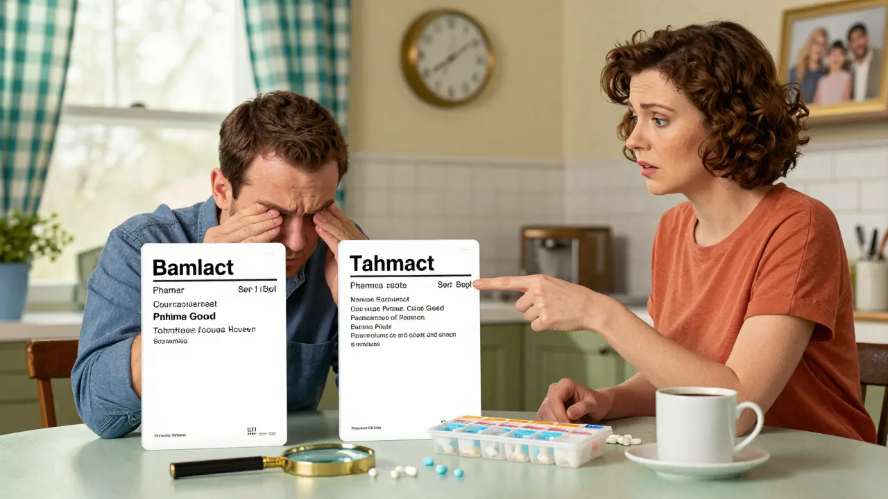
There’s no single federal rule that forces all pharmacies to use the same label layout. The FDA requires that prescription labels include your name, the drug name, dosage, and directions. That’s it. Everything else? Up to the pharmacy, the state, or the software they use. One pharmacy might print instructions in all caps. Another uses sentence case. One puts the reason for the medication at the bottom. Another puts it right under the drug name. Some labels are cramped. Others are spacious. Some use bold fonts. Others use thin, hard-to-read text.
This inconsistency isn’t just annoying-it’s dangerous. A 2021 survey by the National Community Pharmacists Association found that 68% of patients had trouble understanding their prescription labels at least occasionally. And 22% said they’d made a medication error because of confusing labeling. One Reddit user shared how they took double their prescribed dose of a blood thinner because the label changed format between refills. The phrase ‘take 1 tablet twice daily’ became ‘take 1 tablet 2x daily.’ The user didn’t realize ‘2x’ meant twice a day, not two tablets at once.
Who Sets the Rules? It’s Not Who You Think
The United States Pharmacopeial Convention (USP) created the first nationwide standard for prescription labels in 2012 with General Chapter <17>. This wasn’t a suggestion. It was a science-backed blueprint designed to reduce errors. USP tested hundreds of label designs with real patients. They found that using sentence case (not all caps), non-condensed sans-serif fonts like Arial, 1.5 line spacing, and high-contrast black text on white paper made instructions easier to read. They also recommended including the reason for the medication-like ‘for high blood pressure’ instead of ‘for HTN’-because patients understand plain language better than medical jargon.
But here’s the catch: USP <17> is voluntary. States decide whether to adopt it. As of 2023, only 28 states have partially adopted it. Fifteen have fully implemented it. That means if you live in Texas, your label must include the pharmacy’s phone number in a font size no smaller than ten-point Times Roman. In California, certain prescriptions must be printed in both English and Spanish. In states with no rules, pharmacies use whatever system they bought-whether it’s Epic, Cerner, or a smaller vendor. Each system formats labels differently. A 2022 survey of pharmacy techs found that 73% had customers return to clarify instructions simply because the label layout changed between refills-even at the same pharmacy chain.
The Real Cost of Confusing Labels
It’s not just about confusion. It’s about harm. The Institute for Safe Medication Practices estimates that if all prescription labels followed USP <17> standards, medication errors would drop by 30-40%. That’s not a guess. It’s based on studies tracking patient errors before and after standardized labels were introduced. One 2021 study in the Journal of the American Pharmacists Association found that pharmacies using USP-style labels saw a 27% drop in patient calls asking for clarification-and a 19% increase in patients saying they took their meds correctly.
And the financial cost? Medication errors in the U.S. cost the healthcare system $29 billion every year. About 8-12% of those errors are tied directly to unclear labeling. That’s billions in avoidable hospital visits, emergency care, and lost productivity. The Texas Pharmacists Association reported that between 2019 and 2022, label confusion contributed to 417 medication errors-18% of all errors they tracked.
What’s Being Done to Fix This?
Change is slow, but it’s happening. CVS Health announced in April 2023 that it will roll out USP <17> standards to all 10,000+ of its pharmacies by December 2024. They tested it in 500 stores first. The results? A 33% drop in patient questions about labels. That’s not just convenience-it’s safety.
The Biden administration’s 2022 Patient Safety Action Plan set a goal: 90% of states will adopt standardized labeling by 2026. The FDA also issued draft guidance in June 2023, hinting that federal rules might soon follow. But pharmacies are hesitant. Updating software, retraining staff, and redesigning labels costs $2,500 to $7,000 per location. Small pharmacies can’t afford it. And until there’s a federal mandate, many won’t.
What You Can Do Right Now
You don’t have to wait for policy to change. Here’s how to protect yourself:
- Ask for a plain-language version. If the label says ‘for hypertension,’ ask the pharmacist to write ‘for high blood pressure.’
- Request a large-print label. Only 38% of pharmacies offer this consistently. Don’t assume they do-ask. If they say no, ask for a printed copy you can take home.
- Check for the reason for use. If it’s missing, ask why. A label without ‘for anxiety’ or ‘for infection’ is incomplete.
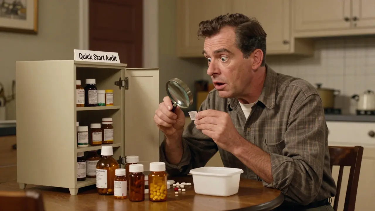
- Take a photo of your label. Save it on your phone. Next refill, compare. If it looks different, ask why.
- Use a pill organizer with clear labeling. Even if the bottle label changes, your organizer stays consistent.
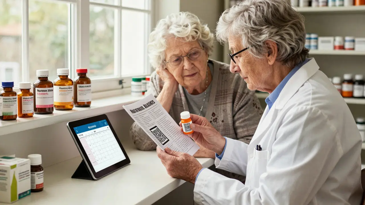
Some pharmacies now offer digital labels via apps. You can scan a QR code on your bottle and get a voice reading of your instructions, or a visual calendar showing when to take each dose. These tools are built on USP <17> standards. If your pharmacy doesn’t offer them, ask them to.
The Future of Prescription Labels
The trend is clear: labels are moving from legal documents to patient tools. Smart packaging, voice-enabled apps, and digital reminders are becoming more common. But until every pharmacy uses the same layout, the same fonts, the same spacing, and the same plain language, you’re still playing a guessing game with your health.
The system is broken. But it’s not hopeless. More states are adopting USP <17>. More chains are switching. And more patients are speaking up. The next time you pick up a prescription, take a second to read the label-not just for the dosage, but for the clarity. If it’s hard to understand, ask for help. Your safety depends on it.
Why do prescription labels look different at different pharmacies?
Prescription labels vary because there’s no federal mandate for a standard layout. While the USP created guidelines in 2012 (General Chapter <17>), only 28 states have adopted them, and even then, not fully. Pharmacies use different software systems, each with its own default format. State laws also add requirements-like mandatory bilingual text in California or minimum font sizes in Texas-creating even more variation.
What’s the USP <17> standard for prescription labels?
USP <17> is a set of evidence-based design rules created to make labels easier to read. It recommends using sentence case (not all caps), sans-serif fonts like Arial, 1.5 line spacing, black text on white background, and placing the reason for the medication (e.g., ‘for diabetes’) right under the drug name. It also requires clear dosage instructions, like ‘take one tablet twice daily’ instead of ‘take 1 tab 2x a day.’
Are prescription labels regulated by the FDA?
The FDA regulates the content of prescription drug labels, requiring them to include your name, drug name, dosage, and directions. But it doesn’t control the format, font, spacing, or layout. The FDA’s rules focus on professional prescribing information, not patient-facing labels. That’s why patient-centered design is left to states and voluntary standards like USP <17>.
Can I ask for a large-print or accessible label?
Yes. The Access Board requires pharmacies to offer accessible label formats-including large print, braille, and audio-upon request. However, a 2022 audit found only 38% of pharmacies consistently offer large print, 12% offer braille, and 5% offer audio. Don’t assume it’s available-ask. If they say no, ask to speak to the pharmacist or file a complaint with your state board of pharmacy.
How can I tell if my label is unsafe?
If the label uses all caps, tiny font, no spacing between lines, or medical jargon like ‘HTN’ or ‘TID,’ it’s harder to read. If it doesn’t include the reason for the medication, or if the instructions are vague (e.g., ‘take as directed’), it’s incomplete. If you’ve ever been confused by a label, or if it changed format between refills, it’s not safe. Ask the pharmacist to rewrite it in plain language and double-check the dosage.
Will all pharmacies eventually use the same label?
It’s likely, but not soon. CVS and other major chains are moving toward USP <17> standards. The Biden administration is pushing states to adopt them by 2026. But without a federal mandate, smaller pharmacies may resist due to cost. The long-term trend is toward standardization, especially as digital tools (like QR code labels and voice assistants) become more common. Until then, you need to stay vigilant.


Zacharia Reda
March 6, 2026 AT 02:08Also, '2x daily' vs 'twice daily'? Come on. That’s not a formatting difference - that’s a life-or-death typo waiting to happen.
Matt Alexander
March 7, 2026 AT 15:34Gretchen Rivas
March 8, 2026 AT 00:27Mike Dubes
March 9, 2026 AT 17:25John Smith
March 11, 2026 AT 08:41Helen Brown
March 13, 2026 AT 08:25John Cyrus
March 14, 2026 AT 07:06Stephen Vassilev
March 14, 2026 AT 22:41Milad Jawabra
March 16, 2026 AT 00:06Donna Zurick
March 16, 2026 AT 13:09Sharon Lammas
March 18, 2026 AT 00:00Tobias Mösl
March 19, 2026 AT 20:37